Bifogade filer
 SleepCycleNewBrand
Prenumeration
Sleep Cycle rolls out a refreshed brand and introduces the next chapter of its journey.
Today, Sleep Cycle, the world’s No. 1 sleep app, introduces the next chapter of its brand journey. This isn’t a reinvention — it’s a thoughtful refinement. We call it the night-to-day concept.
“The Sleep Cycle brand has been at the forefront of sleep analysis for over a decade, and it was important to carry that legacy forward — to honor the users who’ve been with us from the beginning,” says Erik Jivmark, CEO of Sleep Cycle. “The logo you know and trust remains, its shape and familiarity preserved. But it now lives within a broader, more expressive brand system that reflects who we are becoming.”
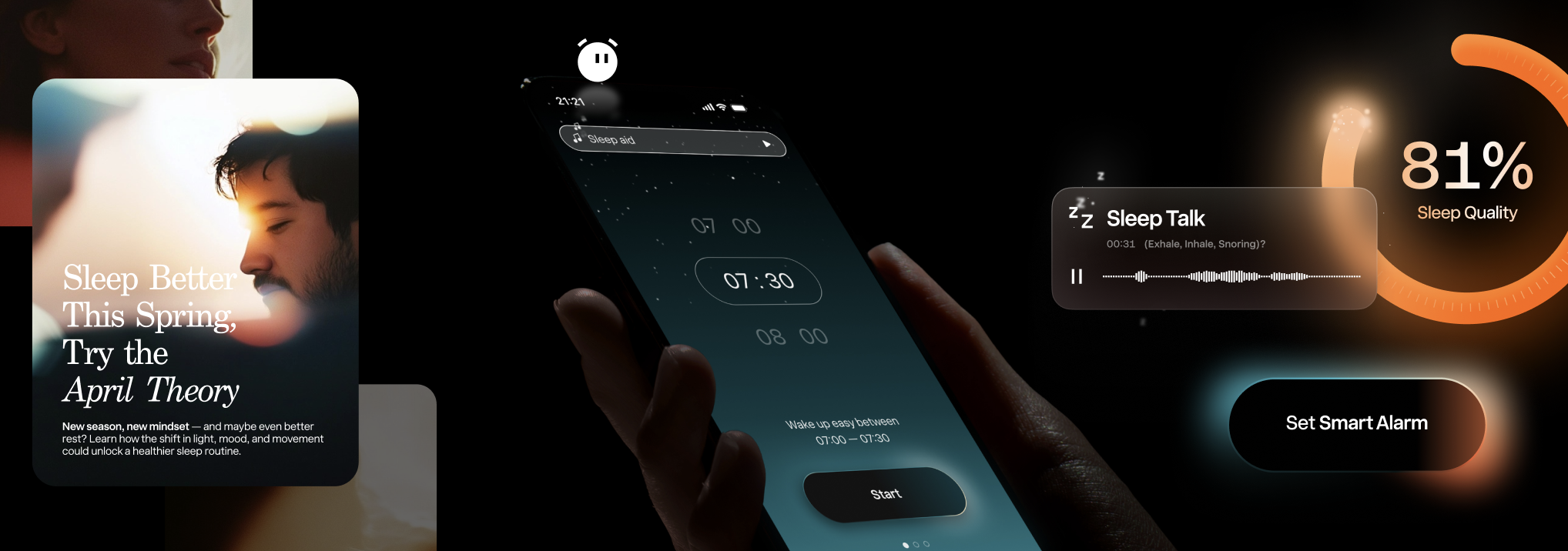
The Concept of Night-to-Day
“When I started at Sleep Cycle, I was struck by the depth of engagement we have with users,” says CPO Petter Höglander. “We meet them when they go to bed and again when they wake up. That continuous interaction is rare — and meaningful. It inspired our new night-to-day concept, built to honor those habitual touchpoints.”
Sleep Cycle’s new visual identity brings the science of sleep into a softer, more human light. Dreamy gradients meet grounded typography and serene imagery — all inspired by the quietude of night and the promise of a well-rested morning. It’s a system built for beauty and backed by intelligence. This brand evolution is rooted in real user behavior — how people wind down at night and rise in the morning. Every design choice was made to guide users fluidly between states of wakefulness and rest.
The Logo, Reimagined — Not Replaced
Brand recognition remained a top priority. Through careful testing and extensive user feedback, Sleep Cycle has preserved the essence of its logo while evolving the system around it. The result is a modernized identity that respects the past and positions the brand for the future.
A Typeface Optimized for Digital Readability
At the heart of the visual update is Innovator Grotesk, a contemporary neo-grotesque typeface crafted for digital interfaces. Precision-engineered for legibility and balance, it addresses common readability issues and provides visual harmony across all screen sizes.
Images Reflecting Real-Life
The new image library reflects Sleep Cycle’s commitment to authenticity. Morning routines with kids, dogs barking, sunlight peeking through curtains — these everyday scenes are now front and center, bringing the brand closer to the lived experiences of its users.
Staying True to Our Tone
Sleep Cycle’s voice remains friendly, warm, and assertive — a trustworthy companion for anyone seeking better sleep.
The Brand Story
Sleep Cycle was born in 2009, sprung from a simple need: a gentler wake-up. The idea was simple but novel — use the phone’s accelerometer to track sleep phases and wake users at the optimal time. That idea blossomed into a globally trusted app, now enhanced with AI-powered sound-based sleep analysis, snore detection, trend tracking, and powerful habit-forming tools. Through it all, the vision has stayed the same — to create a genuine, science-backed experience that fits naturally into people’s lives.
The new identity is rolling out globally this week across the app, website, and all brand touchpoints. Learn more at www.sleepcycle.com